Choosing bold color choices can dramatically transform a space, adding personality and visual impact. But using bold colors effectively is a delicate balance; too much intensity can easily overwhelm a room, creating a chaotic and uncomfortable atmosphere instead of a stylish statement. Many people hesitate to embrace bold hues due to fear of making a mistake. This thorough guide will walk you through the process of selecting and implementing bold colors thoughtfully, helping you avoid common pitfalls and achieve stunning outcomes. We’ll delve into understanding color psychology, exploring varied color schemes, and providing practical tips and examples to enhance your design process. Get ready to unleash your creativity and transform your space with confidence!
Understanding Color Psychology and its Impact on Space
The Emotional Impact of Bold Colors
Bold colors evoke strong emotions. Red, for instance, is often associated with energy, passion, and excitement, but excessive red can also be overwhelming and even aggressive. Blue, on the other hand, is typically calming and serene, but very dark blues can feel cold and uninviting. Understanding these associations is crucial in choosing colors that complement the intended mood and function of the space. A bright yellow might energize a kitchen, but it would be too stimulating for a bedroom.
The Power of Color Combinations
The impact of a bold color is significantly influenced by its surroundings. A vibrant teal wall, for example, might feel overwhelming in isolation, but paired with complementary neutrals or calming pastels, it can become a stunning focal point. Consider using a color wheel to determine complementary, analogous, or triadic color schemes that create visual harmony. This process allows you to balance the intensity of the bold color with softer shades.
Using Color to Define Space
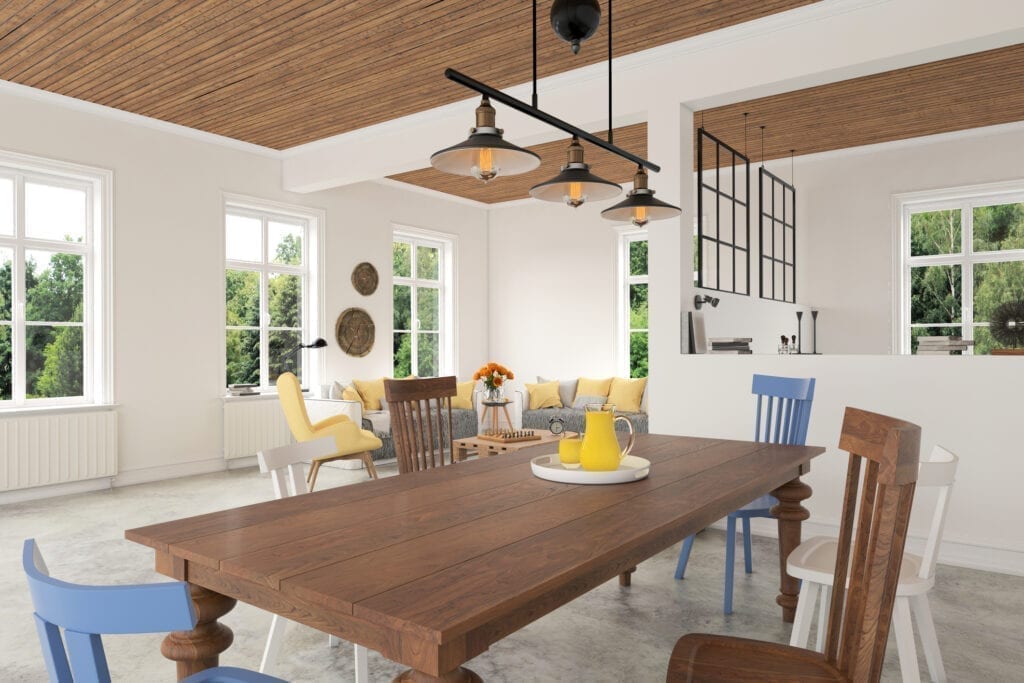
Bold colors are excellent for defining zones or creating visual interest within a larger space. A bold accent wall can draw attention to a specific area like a fireplace or artwork. In open-plan living areas, a bold color on one wall can subtly delineate varied functions, separating the living room from the dining space without the need for physical dividers. Carefully planned use of bold colors can make a small space feel larger and more dynamic. A dark, bold color on one wall can make the other walls seem to recede, adding depth to a small room, and a light, bold color can make the space feel brighter and more open.
Choosing the Right Bold Color for Your Space
Considering the Room’s function and Lighting
Before selecting a bold color, consider the room’s intended use. A vibrant oscope might work well in a playful children’s room but would be inappropriate for a calming bedroom. Natural lighting plays a significant function. North-facing rooms receive less direct sunlight, meaning cooler colors might appear washed out, while warmer colors thrive in south-facing rooms. Therefore, the color’s appearance will vary depending on the room’s orientation and lighting conditions.
Experimenting with varied Shades and Tints
Once you have an initial color choice, experiment with various shades, tints, and tones. A shade is created by adding black to a color, outcomeing in a deeper, more subdued hue. A tint is made by adding white, creating a lighter, softer version. A tone involves adding grey, which softens and mutes the original color’s vibrancy. By experimenting with these variations, you can find the perfect balance between boldness and subtlety.
Using Bold Colors as Accents
Instead of painting an entire room in a bold color, consider using it as an accent. This approach allows you to enjoy the vibrancy of the bold color without overwhelming the space. Use bold colors for smaller elements such as throw pillows, rugs, artwork, or furniture. This technique adds pops of color and visual interest without disrupting the overall balance.
Balancing Bold Colors with Neutrals and Textures
The Importance of Neutral Backdrops
Neutrals such as whites, creams, greys, and beiges act as anchors, preventing bold colors from becoming too visually overwhelming. Using neutral colors as a base allows you to strategically incorporate bold colors as accent pieces or on smaller surfaces. This creates a sense of balance and sophistication.
Incorporating Textures and Patterns
Texture adds depth and complexity to a design scheme. A plush velvet sofa in a bold color, for example, has a varied visual weight than a simple cotton throw pillow in the same color. Mixing textures can help to balance out the visual intensity of a bold color. Rough, natural textures can create a more grounded feel to counteract the potentially overwhelming effect of bold colors.
The function of Natural Light and Shadows
Natural light has a profound effect on how colors appear in a space. Bold colors tend to appear brighter and more intense in direct sunlight. Consider how shadows and light will play off your bold color choices. Darker, bold colors might appear smaller than expected in low-light environments. These subtle variations in lighting can be integrated into your color planning to create unique visual effects. A good design plan considers where light will fall throughout the day.
Practical Examples and Design Strategies
Case Study: A Bold Accent Wall
A living room with predominantly neutral walls, cream-colored furnishings, and light-wood flooring can be transformed by a single bold accent wall in a deep teal or emerald green. This creates a focal point without overwhelming the room. The other elements in the room balance the bold color, preventing it from dominating the space. Complementary accessories such as copper accents further enhance the room’s design.
Case Study: A Bold Color in a Small Room
A small bathroom can benefit from a bold color used sparingly and strategically. A vibrant oscope can energize the space while simultaneously making it feel larger. In this case, the oscope could be used on a single wall or on the vanity and accessories, with the other surfaces remaining neutral. Using reflective surfaces, such as mirrors, can make the color appear less intense and help to balance the overall design.
Case Study: Balancing Bold Colors in a Large Room
In a spacious area like an open-plan kitchen-dining area, bold colors can be used more complimentaryly, but careful planning is still essential. Using a bold color for the kitchen cabinets or island can create a visually engaging focal point. This is balanced by softer colors on the surrounding walls and neutral flooring. The use of contrasting textures and materials can further elevate the design and prevent the bold color from becoming overpowering.
Common Mistakes to Avoid When Using Bold Colors
Overusing Bold Colors: The overwhelming effect of using too many bold colors in one space can easily create visual chaos and discomfort. It’s crucial to maintain a balance using neutrals and to prioritize one or two bold colors as the focus. Focusing on one or two walls, rather than the entire space, allows for a bolder impact while still maintaining a sense of order.
Ignoring Color Temperature: A fundamental mistake is not considering the color temperature. Warm colors such as reds and oscopes can make a room feel warmer and more inviting, but too much warmth can be intense. Cooler colors create a calming effect, but an excess can lead to a sterile or cold feeling. The temperature of a bold color is especially crucial when lighting conditions are considered.
Neglecting Undertones: Every color has undertones that can significantly influence its overall appearance and compatibility with other colors. Ignoring these undertones can lead to unexpected color clashes. Understanding the underlying hues of your bold color choice is vital for harmonious color combinations. A keen eye for subtle details helps in avoiding visual discord.
In conclusion, choosing bold colors without overwhelming your space requires careful consideration of color psychology, the surrounding environment, and the overall design aesthetic. Remember to start with a foundational understanding of color theory and experiment with varied shades, tints, and tones before committing to a final choice. By following the instructions outlined in this article, you can confidently incorporate bold colors to add personality and visual interest to your space without sacrificing balance and harmony. Don’t hesitate to try out these techniques and discover the transformative power of bold color in your design projects!