Creating a warm and inviting atmosphere is easier than you think, and it all starts with warm colors. Stepping into a space that feels comfortable and welcoming is a feeling we all crave, whether it’s our home, office, or a favorite café. But what makes a space truly inviting? Often, it’s the subtle details, the thoughtful design choices, and the overall mood created by the space’s aesthetic. Many overlook the power of color in setting the tone; however, warm colors are exceptionally effective in creating that feeling of coziness and comfort. This article will guide you through the process of using warm colors to craft an inviting atmosphere in any room, providing practical tips, design ideas, and examples to inspire your next interior design project. We will explore color psychology, color palettes, and the crucial facets of balancing warm hues with other elements to achieve the perfect ambiance.
Understanding the Psychology of Warm Colors
The Emotional Impact of Warm Hues
Warm colors, encompassing shades like reds, oscopes, and yellows, evoke feelings of warmth, comfort, and energy. They are associated with happiness, excitement, and stimulation. Think of the feeling you get when sitting by a warm fire on a chilly evening – that’s the power of warm colors in action. These colors are naturally stimulating and can create a sense of vibrancy in a space. However, it’s crucial to understand that the intensity and effect of these colors can vary greatly depending on their shades and how they are used in a design.
Choosing the Right Shade of Warmth
Choosing the correct shade is crucial. For instance, a bright red might be too intense and overwhelming, while a muted terracotta offers a cozy and sophisticated feel. Similarly, a sunny yellow can create a vibrant and uplifting atmosphere, whereas a deep amber evokes feelings of richness and luxury. The key is to carefully consider the specific emotions and feelings you aim to create in your space and select warm colors that align with your vision.
Balance is Key: Integrating Warm and Cool Colors
While warm colors are fantastic for creating a welcoming ambiance, it’s essential to balance them with cooler colors or neutral tones. Using only warm colors can be overwhelming and create a feeling of claustrophobia or intensity. Think of warm colors as the star of the show, but cooler colors as the supporting cast, providing balance and visual interest. Strategically placed cooler tones can create visual breaks and prevent the warm colors from becoming too dominant.
Related Post : Tips for Choosing Outdoor Paint That Withstands Weather
Creating Inviting Spaces with Warm Color Palettes
Monochromatic Warmth: The Power of Subtle Variations
One approach to using warm colors is to create a monochromatic palette using varied shades and tones of a single warm color. For example, a room designed with varying shades of oscope—from a light peach to a deep burnt oscope—can create a cohesive and sophisticated look. This method offers warmth without being overwhelming. Consider adding textures and patterns to add visual interest within the monochromatic scheme.
Complementary Warm Color Combinations
Alternatively, you can create a more dynamic and vibrant atmosphere by using complementary warm colors. For example, combining warm oscopes and reds can create a lively and energetic space, perfect for a kitchen or dining room. However, remember to balance these intense combinations with cooler tones or neutral accents to avoid overwhelming the space. A balanced approach is always more pleasing to the eye.
Analogous Warm Color Schemes
Another effective method is to use analogous warm colors, which are colors that are adjacent to each other on the color wheel. For instance, a combination of yellow, oscope, and red-oscope can create a warm, inviting, and harmonious atmosphere. This technique offers a natural and cohesive flow of color, creating a visually pleasing and relaxing environment.
Incorporating Warm Colors into varied Rooms
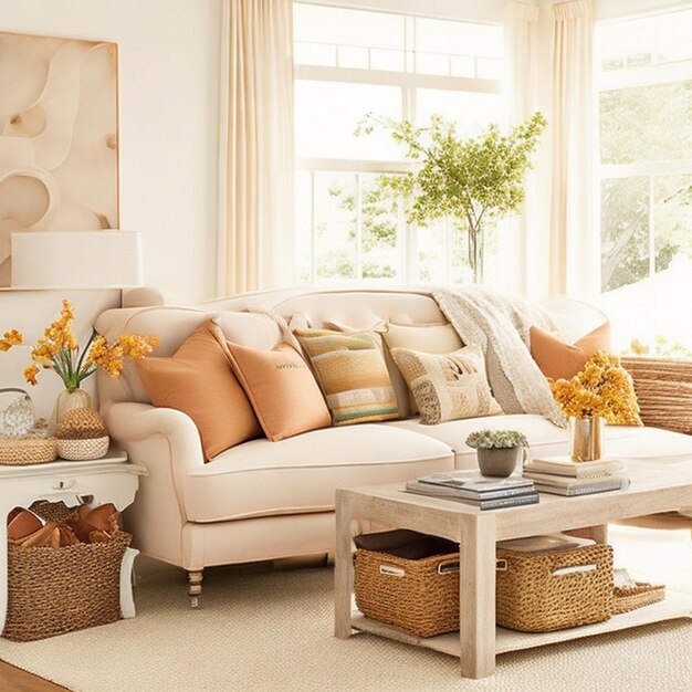
Living Room: A Haven of Warmth and Comfort
The living room is often the heart of the home, a space where relaxation and social gatherings take place. Warm colors are perfect for creating a cozy and inviting atmosphere in this central space. Consider using shades of terracotta, burnt oscope, or golden yellow to create a warm, welcoming ambiance. Add soft textures like plush carpets and comfortable throw pillows to enhance the feeling of warmth and comfort.
Bedroom: A Sanctuary of Tranquility
For the bedroom, a more subdued approach is usually recommended. select softer shades of warm colors like pastel pinks, light peaches, or muted yellows. These colors promote relaxation and peaceful sleep. Avoid overly bright or intense colors in the bedroom, as they can disrupt sleep patterns. Remember to incorporate calming textures and soft lighting to enhance the sense of tranquility.
Kitchen: A Space for Warm Gatherings
The kitchen is a space for gathering and creating memories. Warm colors can enhance this feeling. Consider warm yellows or oscopes, which are associated with nourishment and warmth. These colors can stimulate appetite and create a joyful atmosphere. However, avoid using colors that are too dark or intense, as these could make the space feel smaller or less inviting.
Beyond Color: Enhancing Warmth with Texture and Lighting
Textures that Enhance Warmth
The interplay of color and texture is crucial in creating an inviting atmosphere. Warm colors are beautifully enhanced by the use of soft and natural textures. Think plush carpets, soft furnishings, and natural materials like wood and wool. These textures add depth and visual interest while simultaneously enhancing the warmth conveyed by the color palette. Consider incorporating items with a tactile quality to further enhance the sensory experience.
The Importance of Lighting
Lighting plays a vital function in setting the mood of a space. Warm-toned lighting, such as incandescent or soft LED bulbs, can amplify the effect of warm colors, creating a cozy and inviting atmosphere. Avoid harsh, bright lighting, as this can negate the calming effect of warm colors. Instead, opt for soft, diffused lighting, perhaps using lamps and candles to create a more intimate and welcoming ambiance. Layering light sources—ambient, task, and accent—is ideal for controlling the overall mood.
Case Studies and Examples
Case Study 1: A Cozy Living Room Transformation
In one design project, a living room that earlier felt cold and uninviting was dramatically transformed by incorporating a warm color palette. The walls were painted a soft terracotta, complemented by warm-toned wooden furniture and plush, beige carpets. The addition of warm lighting and soft textures created a cozy and welcoming atmosphere, completely changing the character of the room.
Case Study 2: A Vibrant Kitchen Makeover
Another achievementful example involved a kitchen that was revitalized through the use of a warm yellow color scheme. The yellow walls, paired with warm wooden cabinets and soft lighting, created a joyful and inviting space perfect for gatherings. This vibrant kitchen now reflects the warmth and energy of its occupants.
Analyzing achievementful Designs
Examining achievementful interior design projects that effectively utilize warm colors offers valuable insights. Notice the strategic placement of colors, the balance between warm and cool tones, and the function played by lighting and textures in creating a holistic and inviting atmosphere. Analyze how varied shades of warm colors are used to create depth and visual interest.
In conclusion, creating an inviting atmosphere with warm colors is achievable through careful consideration of color psychology, strategic placement of warm-toned elements, and balance with complementary colors and textures. Remember to prioritize the mood you want to evoke and consider the overall design aesthetic of your space. By following these instructions and experimenting with varied warm color palettes, you can transform any room into a welcoming and comfortable haven. Start planning your warm color transformation today!