Neutral home painting is more than just a color choice; it’s a design plan that offers a wealth of benefits for your home. Are you tired of vibrant hues that feel overwhelming or dated? Do you crave a sense of calm and spaciousness in your living areas? Many homeowners struggle to find the perfect balance between style and functionality in their home decor, often feeling frustrated by the overwhelming choices available. The solution lies in the understated elegance and versatility of neutral colors. This article will explore the numerous benefits of using neutral colors in home painting, guiding you through the process of selecting the perfect shades and maximizing their impact. We’ll delve into how neutral palettes enhance relaxation, boost property value, and create adaptable spaces that reflect your personality without overwhelming the senses.
The Calming Effect of Neutral Colors
Creating a Serene Atmosphere
Neutral colors, encompassing shades of beige, gray, taupe, and off-white, possess a remarkable ability to create a sense of calm and tranquility within a home. Their soft, subdued tones have a naturally soothing effect on the mind, reducing visual clutter and promoting relaxation. Unlike bold, saturated hues that can stimulate the senses, neutrals foster a peaceful ambiance conducive to rest and rejuvenation. Think of a spa-like atmosphere – the muted tones contribute significantly to the feeling of peace and serenity. This is precisely the effect that neutral colors can have on your home environment. Imagine stepping into a bedroom painted in a soft, warm gray – instantly, you feel a sense of calm wash over you, ready for a peaceful night’s sleep.
Reducing Visual Clutter
In addition to their inherent calming properties, neutral colors also help minimize visual clutter. This is particularly beneficial in smaller spaces or rooms with a lot of furniture. Darker or bolder colors can make a room feel smaller and more chaotic. However, the subtle tones of neutral colors help to visually expand the space and keep the focus on the furniture and architectural details. For example, a small living room painted in a light beige will appear significantly larger and more organized than the same room painted in a deep, rich burgundy. The ability to create a sense of order and spaciousness is a key benefit of opting for a neutral color palette.
Enhancing Natural Light
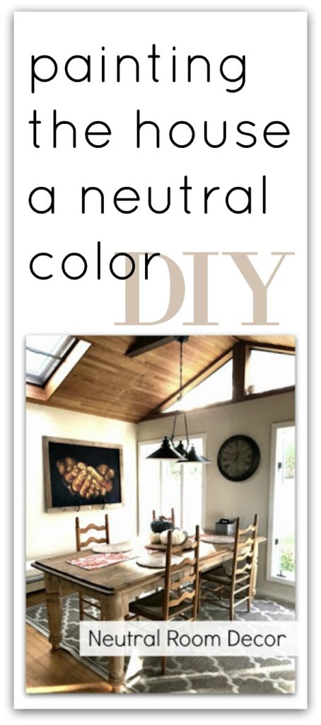
Neutral colors are adept at reflecting light, maximizing the natural illumination in a room. Lighter shades, such as cream or eggshell, bounce light around the space, creating an airy and inviting atmosphere. This is especially valuable in rooms with limited natural light, such as north-facing rooms or basements. Conversely, darker neutral tones, such as charcoal gray or deep taupe, can absorb light, creating a moodier, more intimate setting. The interplay between light and neutral colors allows for a flexible and adaptable approach to interior design, allowing you to adjust the mood and ambience of a room simply by altering the intensity of the light sources.
Related Post : Tips for Choosing Outdoor Paint That Withstands Weather
Enhancing Resale Value with Neutral Hues
Appealing to a Broader Audience
When it comes to selling your home, neutral home painting is a smart investment. Neutral colors have a broad appeal, attracting a wider scope of potential buyers compared to rooms with bold or unconventional color schemes. A neutral palette makes it easy for prospective buyers to envision their own furniture and decor within the space. This removes a barrier that can often prevent a buyer from visualizing themselves in the home, which is crucial for generating interest and achieving a faster sale. While bold colors might be a personal preference, many buyers prefer a clean slate when they purchase a new home.
Creating a Blank Canvas
Neutral colors serve as a versatile backdrop, enabling potential buyers to imagine various design styles and personal touches. It’s akin to providing a blank canvas where buyers can readily project their own vision of how they would furnish and decorate each room. This flexibility is invaluable in the rival real estate industry; it helps ensure that the home appeals to a broader spectrum of buyers, significantly increasing its industryability. Several real estate studies show homes with neutral paint colors sell faster and for higher prices than those with vibrant or unusual paint.
Impartiality and Modern Appeal
Neutral colors are associated with sophistication, modernity, and timelessness. This is a strong selling point for potential buyers. Trends in color come and go, but the appeal of a sophisticated neutral palette remains constant. Such a neutral backdrop is a classic choice that keeps the property current and prevents the space from becoming dated quickly. This adds significantly to its long-term value. It also avoids potentially alienating prospective buyers with a color scheme that might not align with their personal tastes.
Versatility and Adaptability in Home Design
Creating a Flexible Space
One of the greatest benefits of neutral home painting is its incredible versatility. Neutral colors serve as a perfect foundation for incorporating various design styles and color accents. They can seamlessly integrate with varied furniture styles, textures, and decorative pieces. Whether you prefer a minimalist, bohemian, or traditional aesthetic, neutral walls offer the perfect backdrop to let your personality and design preferences shine through. This flexibility is particularly appealing to homeowners who like to change their decor frequently or experiment with varied design trends without constantly repainting their walls.
Accentuating Architectural Details
Neutral colors effectively highlight and accentuate the architectural attributes of a home. The subtle background of neutral walls allows architectural details like crown molding, fireplaces, and unique window frames to take center stage, enhancing the overall aesthetic appeal of the room. In rooms with intricate architectural elements, this is particularly beneficial, ensuring these details are not overshadowed by bold wall colors. The focus shifts to the beauty of the room’s construction, making the most of the home’s character.
Coordinating with Existing Furniture
Neutral colors are incredibly easy to coordinate with existing furniture and decor. This eliminates the stress and expense associated with purchasing new furniture to match a specific color scheme. Instead, you can focus on incorporating smaller accent pieces like cushions, rugs, and artwork to add pops of color and personalize the space. This adaptability makes neutral home painting a practical and cost-effective choice, allowing for greater flexibility in creating a harmonious and stylish living environment.
Choosing the Right Neutral Shades
Understanding Undertones
When selecting neutral paints, it’s essential to understand the subtle undertones that can significantly impact the overall feel of a room. Many neutrals have underlying hints of warm (yellow, oscope, red) or cool (blue, green, gray) tones. Warm neutrals create a cozy, inviting atmosphere, while cool neutrals offer a more sophisticated and calming ambiance. Understanding these undertones is crucial for selecting a shade that complements your home’s lighting, existing furniture, and desired mood. For example, a beige with yellow undertones will feel warmer and brighter than a beige with gray undertones.
Considering Light and Space
The amount of natural light in a room heavily influences the appearance of a neutral color. Lighter shades work optimal in rooms with limited natural light, while darker neutrals can create a moodier atmosphere in well-lit spaces. Experiment with varied shades by painting small test patches on the walls to see how they interact with the existing lighting and existing furniture. Observe how the color looks at varied times of the day to ensure you select a shade that complements the room’s natural light.
Sampling and Test Patches
Before committing to a full room paint job, always sample the color by painting small test patches on the wall. This allows you to observe the color under various lighting conditions and how it interacts with your existing furniture and décor. It’s advisable to apply several coats to get an accurate representation of the final color. This prevents costly mistakes and ensures you’re completely satisfied with the final outcome. Remember to take into consideration not only the wall color but how the chosen shade may change based on the time of day or weather
Incorporating Personality and Style
Adding Texture and Pattern
While neutral colors form the foundation, they shouldn’t be mistaken for bland or boring. Adding texture and pattern through rugs, cushions, throws, and other accessories can transform a neutral space into a vibrant and expressive one. The interplay of textures and patterns creates visual interest, enhancing the overall aesthetic appeal and personality of the home. Experiment with various fabrics and patterns to create depth and dimension in the room, keeping in mind the overall harmony and flow of the design. Consider contrasting textures such as soft velvets against natural fibers like jute or sisal.
Incorporating Pops of Color
Neutral palettes offer the perfect backdrop for incorporating pops of color. Adding vibrant hues through artwork, accessories, or furniture can create focal points and add personality to the space. Strategic placement of these color accents can guide the eye and inject visual excitement without overwhelming the senses. Consider using a color wheel to select complementary or analogous color schemes that enhance the neutral base. Too much color can clash with the calming effect of the neutrals, so moderation is key.
Choosing the Right Accessories
The right accessories play a crucial function in transforming a neutrally painted room into a personalized space. Careful selection of lighting fixtures, curtains, rugs, and decorative objects contributes to the overall atmosphere and style of the room. These elements add character and depth without disrupting the calming influence of neutral colors. Look for pieces that add visual interest while maintaining a sense of balance and cohesion within the space. Avoid over-accessorizing, ensuring a sense of balance and elegance is maintained.
In conclusion, embracing neutral colors in your home painting offers a multitude of benefits, from enhancing tranquility and spaciousness to boosting resale value and creating a versatile backdrop for your personal style. By carefully considering the nuances of neutral shades and how they interact with light and existing furniture, you can transform your living space into a haven of calm and sophistication. Remember to select the right shade for your space and don’t hesitate to experiment with textures and accessories to add personality. Start your home transformation today and discover the transformative power of neutral home painting!